Quantcast
Channel: The Architecture of Early Childhood

Work and play being introduced into the workplace (I want to work here!)

$
0
0
 
It's not only schools that are slowly adopting the early childhood idea of zones catering for a range of types of work, play and leisure (with "break-out" areas, flexible and individual learning zones). Now work places are beginning to see the benefit in offering employees a variety of type of space for increased productivity and employee satisfaction.


An example of such a work place, which is in fact reminiscent of a number of contemporary EC designs where spaces are placed within spaces (here, here and here), is Airbnb's new "CX" Customer Experience office in Portland, USA.


Designed in-house by trained architects Aaron Harvey and Rachael Yu, the concept was developed with extensive research into the working habits and requirements of CX employees.


The designers collaborated with the (some 200) Airbnb employees, and found their requirements to be that of which would allow them to work in array of styles - to move around and make use of an array of spaces and choose the environment that suits their needs.


Complementing their flexible work practices, the office design provides 'landing/standing' spaces for impromptu team meetings. There are lounges, shared tables, private nooks and a mezzanine called "the bluff", which is an elevated work space made from plywood and lined with cushions, where you can survey the office space below.


This idea of flexibility and that of choice (of how to work, and how to interact with others) works to create an enjoyable environment in where let's face it, where we all spend most of our days.

Via Yellow Trace.

Forgotten 1960s toys are remembered at this London exhibition

$
0
0

In the 1960s and '70s a number of designers began to re-think the kind of objects that children required to play (and thus learn) with. As Jean Piaget said, "play is the serious business of children".


Above, Four-Way Blocks, Fredun Shapur 1972, Creative Playthings

'Play: Toys, Sets, Rules' is brought about by London Studio Systems  and brings together toys from the personal archives of their designers - a loosely associated group that emerged in London in the 1960s.


Above left, Zic-Zag, Fredun Shapur 1980, produced by Kurt Naef; Right, Serpentino, Fredun Shapur 1980, produced by Kurt Naef

The exhibition, which is part of the 2015 London Festival of Architecture offers a unique survey of late modernist approaches to child development and design, and provokes a discussion around play as formulative and speculative activity.


Above, Cube tray, designer unknown c. 1970, producer unknown

The play objects are indeed beautiful and finely crafted and could stand proudly displayed on a mantel piece in addition to offering curious interactment.


Above left, Sechseck Legespeil by Viereck Legespeil and Fünfeck Legespiel, designer unknown c.-1960 ;Right, Polyroly, Roger Limbrick 1968, produced by Polypops Products Ltd

The various toys on exhibit include themes of modularity (with blocks and interslotting components) to build any imaginable structure, furniture, or machine; geometric puzzles - such as the cube tray and the Sechseck Legespeil and marbles.


Above, Polidoblocs, Dr Margaret Lowenfeld c. 1950, produced by ESA

All featuring bold colours and natural materials. The toys are reminiscent of Froebels 'gifts'inducing both an appreciation of form and of creative thought in the curious child.


Above left, Plytek Stool, Ken Garland + Associates c.1965, unrealised prototype; Right, Interslot, Roger Limbrick c.1964, produced by Roger Limbrick Associates

If you're in London, go check it out!


Details:

THE PLAY:TOYS, SETS, RULES

WORKSHOPS: Accompanying the exhibition is a series of free workshops for children aged 7-12 years in craft activity, allowing their creative imaginations to run wild. To book a place, email info@systemsproject.co.uk

//childhood327.rssing.com/chan-9368681/latest-article3-live.php

$
0
0


Are you an architect of a school, kindergarten or university? 

The Architectural Review is seeking the most exciting places of learning in the world - from kindergartens to universities, nurseries to high schools.

Enter the AR Awards by August 7th for the chance to win a mini film to be made of your project, and  to gain much international exposure.

For more info, see here.

The abstract Albers' vision lives on in this beautiful artists' residence & centre in a remote African village

$
0
0
 
In 1971, Josef Albers established a not-for-profit organisation The Josef & Anni Albers Foundation to further the "revelation and evocation of vision through art".


Left is Josef, and right his wife Anni Albers, both leading pioneers of the abstract 'modernist' art movement in the 20th century.

The foundation was to preserve and continue to promote the work of Josef and Anni Albers' aesthetic and philosophical principles in which they lived.


Both among the leading pioneers of 20th century modernism, Josef was best known for his 'homages to the square' and for his innovative 1963 publication 'Interaction of Colour'; and Anni, a textile designer, weaver, writer and print-maker inspired a reconsideration of fabrics as art form. The couple met in 1922 at the Bauhaus Art School in Germany.
Left is Josef Albers''Homage to the Square'. Right is Anni Albers' cotton weaving 'Open Letter'. Both are clearly reflected in the new 'Thread' art & cultural centre in Senegal.

'Thread', a new artists' residence and cultural centre in a small village in remote Senegal, Africa was designed pro bono by New York architect Toshiko Mori and was initiated by the Albers Foundation is a living testament to the Albers' vision and aesthetic and philophical aspirations.


On opening day this past March, more than 1,000 people from Sinthian and surrounding villages flocked to the center. In one of the light-filled courtyards, community members delivered hours of speeches, dances, rap music, and skits.

The design cleverly responds to the hot and dry climate, as well as to taking into account the local and cultural traditions, labour and materials.


Flexible open space and courtyards provide ample room for children to use and play.

Low-slung brick walls perforated in a geometric pattern resembling Josef Albers' work provides ventilation and light whilst keeping dust out. A parametrically undulating roof rests upon these solid walls, constructed of 3 layers of bamboo topped with thatch.

The undulating roof is constructed by local workers with native bamboo and thatch. Community members contribute to the center’s maintenance.

The sloping roof directs rainwater into canals which then drain into covered cisterns, allowing the water to be harvested.

The figure eight plan accommodates two artists' residences in the north-west and south-east corners, while two circular courtyards serve as venues for performances and meetings. Open/flexible space allows further for any activity the community desires.


The project successfully "threads" the local with international (and modern) abstract vision. A testament to how architecture can both respond to concept and physical change.

A rooftop deck terrace gives the impression of drifting over the sea at this new Japanese Kindergarten

$
0
0

The OB Kindergarten designed by Youji No Shiro and HIBINOSEKKEI (also designers of the very cool D.S. Nursery see post here) in Nagasaki, Japan responds to it's ocean-fronted, yet urban dense site with a form that both makes the most of it's blue view and lack of outdoor space for play with a rooftop playground.


Seen below, a central feature of the kindergarten design is a rope loft that can only be accessed by the children having to climb up the rope-made tunnel to be greeted with a rooftop terrace facing the ocean.


Blackboard walls, house-shaped hideouts and dens, varying types of lighting and materiality and texture makes for a creatively stimulating and physically fun place to explore one's capabilities and in which to grow a "challenging mind".


A sunny indoor and outdoor terraced double-height glazed dining hall is a central coming-together point in which the children can share their all important meal times.


The architects believe that art is also especially important and have provided "messy" spaces (along with the many blackboard walls) for this activity to occur.


I'm well impressed with Youji No Shiro's continuing work in the area of EC architecture and look forward to seeing what more they come up with.

The Brutalist Playground: An Exhibition

$
0
0
 
Showing at the The Architecture Gallery, RIBA (London)  is this re-imagining or exploration of the Brutalist playground landscape of the now perceived as cold post-war housing estates.

Commissioned by Assemble and artist Simon Terrill, the exhibition running till August 16th will portray elements of the Brutalist playground in life size form within the gallery space - forcing the viewer to look at the materiality and visual language of these bold "city renewal" architectural ambitions.

Introductory video below... Looks interesting!


Via Architecture.com.

Winner of the 2015 RIBA Awards, the Arcadia Nursery implements "free play" for a child's learning

$
0
0
 
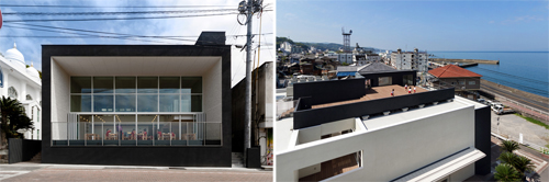
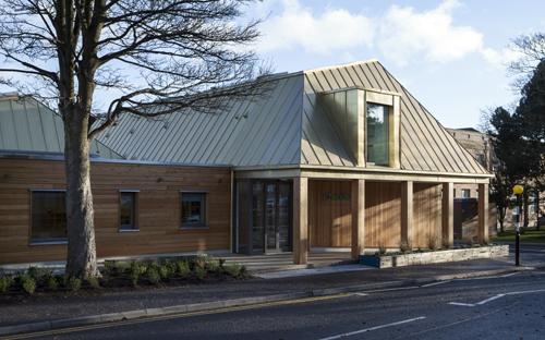
The Arcadia Nursery, a winner of the recently announced 2015 RIBA National Award has been praised for its design encouraging "free play". An approach that nurtures childrens' creativity and independence, allowing their confidence to grow.


Designed by Malcolm Fraser Architects, the 110 (0-5 years) child capacity centre was designed to provide early education and care for children of The University of Edinburgh staff, students and wider public.


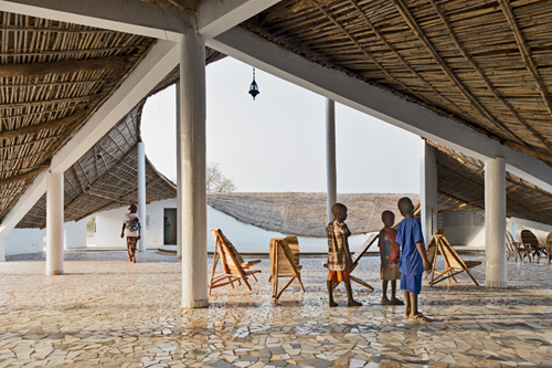
The architects worked with the site's existing nursery managers and identified a number of issues with the existing buildings. Namely disconnected spaces, a lack of connection to the outdoors, no opportunities for the children to come together in one space, difficultly settling children when changing age groups, and the financial strain of over-staffing due to small rooms and remote children’s WCs and baby change.

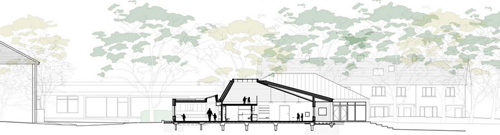
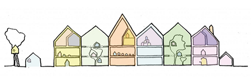
Above, a section showing the building's modest form yet varied size space including mezzanine (or loft) spaces.

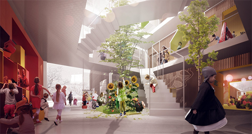
Their solution was to consider the new nursery as a free-flowing series of interconnected spaces that could be opened-up or closed-off to suit the activities of the day.


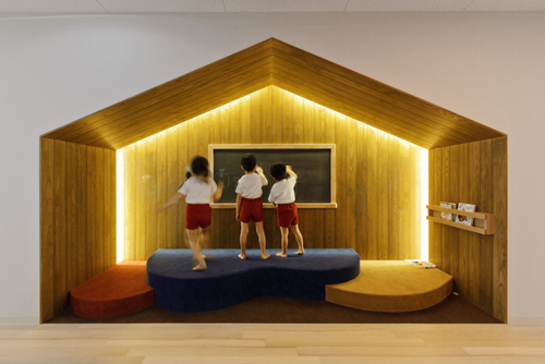
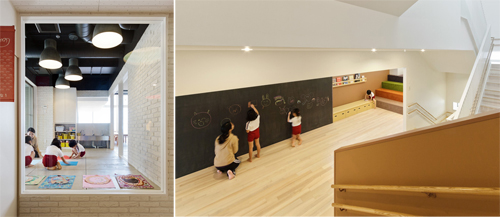
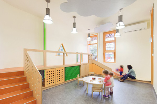
The focus being not solely on one playroom per age group, but a series of additional spaces such as shared messy / art rooms, a children’s kitchen, raised cosy mezzanine spaces for quieter times, and a music and reading room, which are all connected at the heart of the building with a flexible welcome and circulation space, used for many functions including dining and coat storage.


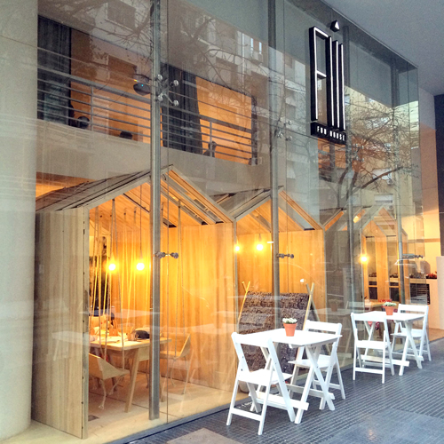
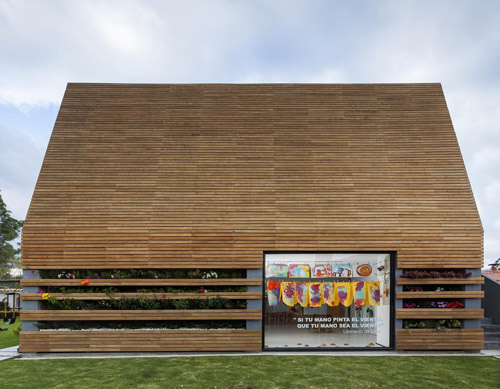
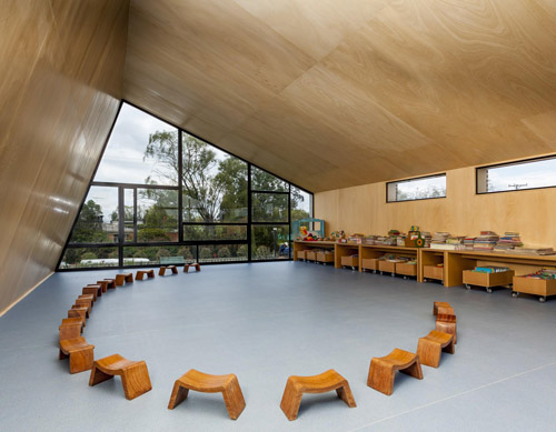
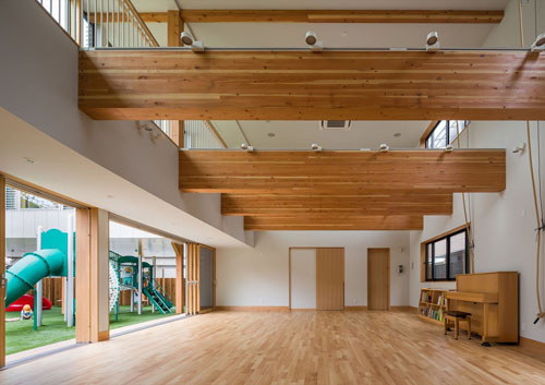
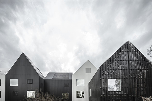
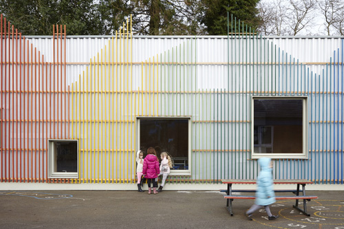
It is a simple form consisting of three playrooms each with access to a covered terrace and linked with a flexible central space. The cross-laminated timber structure provides the perfect combination of creating a warm, tactile interior whilst also using a natural, sustainable product that could structurally achieve the clear roof volumes catering to mezzanine spaces.


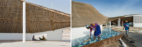
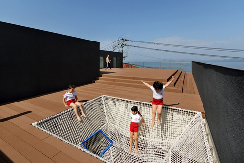
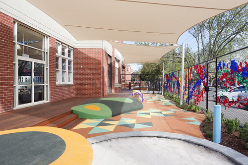
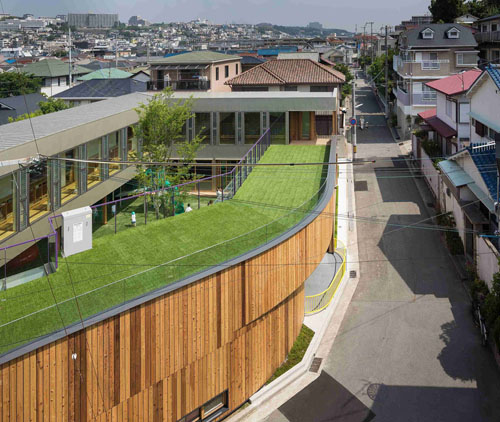
Outdoor spaces are considered as another "playroom" for the nursery, and is thus treated with as much importance.

The garden is divided into three distinct zones: The "enclosed" garden is directly accessed from the nursery building and allows the children to spill out form the playrooms. A covered terrace provides an intermediate space between the indoors and out and includes grass steps, a bubble bridge, stacking boxes, a water pump, raised vegetable planters, a slide, a climbing rope, stepping stones and a potting shed, all encouraging ‘open-ended’ creative play.

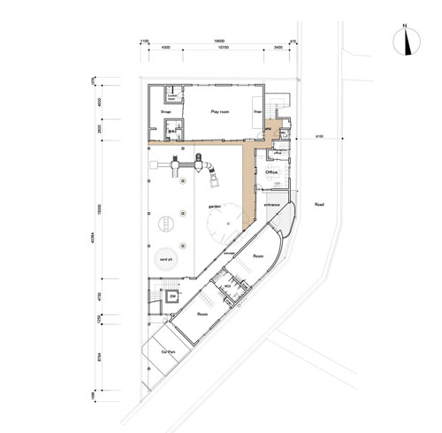
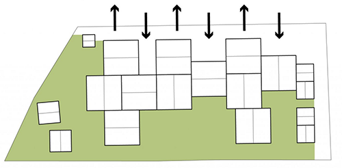
Above, a site plan showing the large amount of outdoor landscaped play space.

The third zone is the wider (not enclosed) landscape accessed via a gate with a raised timber walkway (seen above) providing a journey through the trees. This takes the child to a more 'adventurous' playground entailing a rope bridge, climbable trees, log ladders, a sandpit, mounds and meadows where the grass is allowed to grow long and flowers, birds and bees are observed.


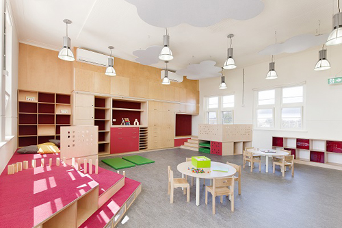
Careful consideration has also been paid to the child's health and well being with natural daylighting and ventilation, a minimal palette utilising mostly good quality natural materials and non-institutional hanging lights. All inducing a homely feel.


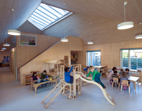
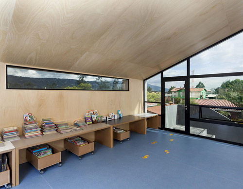
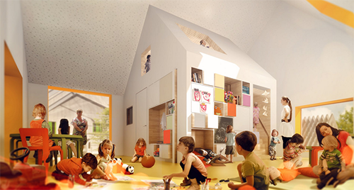
Mezzanine spaces overlook the playrooms, while a skylight offers views to the sky and tree canopies above.

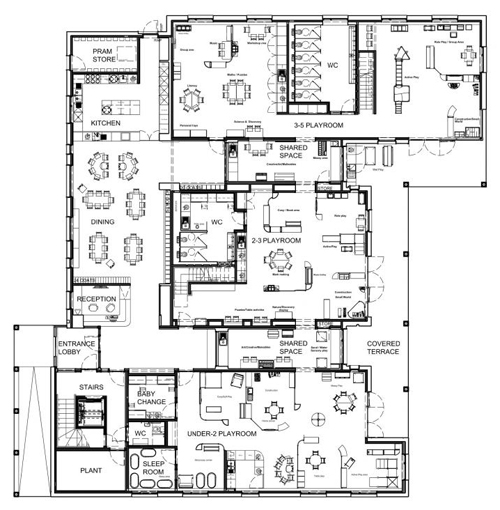
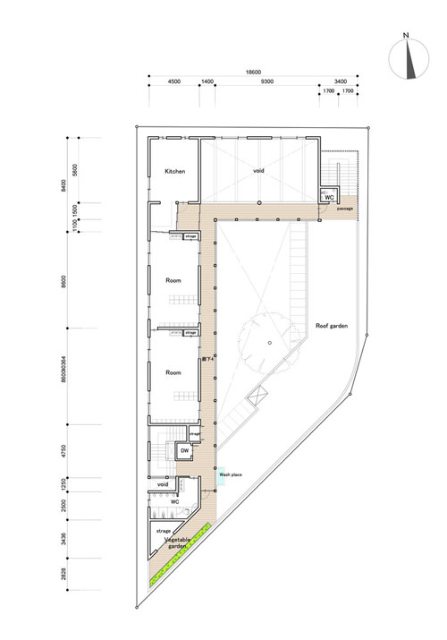
Above, the ground floor plan shows the mix of functional spaces being provided (i.e. sleep room, baby change areas and pram storage) with interconnected flexible, shared play spaces offering freedom and choice to the child for their learning.

The "free play" pedagogy is about encouraging children to choose which activities they would like to participate in or whether they would like to play inside or outside instead of the day being dictated to them. The Arcadia Nursery manages to realize this vision whilst ensuring the safety and well-being of the children it caters to.

A cafe with swings, playrooms and tables with coloured pencil holders

$
0
0
   
Parents to two children, Mariela Vergagni and Diego Cores envisaged a a cafe where children could have just as much fun as their parents.


Seeking the help of architect Íris Cantante, they set out to see their idea take life.


The result is Fii Fun House, a cafe downstairs and event space up.


The design uses the idea of breaking down space with simple wooden hut shaped structures, vertical slat fencing and a wide variety of furniture.

Swinging seats, fabric cushioned pods, bench seats and a children's playroom all work to provide choice for the customer user and ensure all are comfortable.


The tables even have pencil and crayon holders embedded in them for children (or adults too!) to use and express their creativity.
 

All cool ideas for an EC centre or any space in fact that considers our youngest users.


A striking light-filled voluminous form is used at this kindergarten in Colombia

$
0
0
 
Conceived of as a large cabin, La Leroteca (part of the 'Lero Lero' kindergarten in Cundimarca, Colombia) is comprised of largely two types of space. Downstairs a white walled art (painting) studio with easy access to the outdoors, and upstairs a warm timber-walled cavernous space for more quiet (reading and writing) activity.


Designed by Lacaja Arquitectos with the supervision of Gloria Serna Meza, the bold and simple form is clad in horizontal timber slats cleverly incorporating a flower garden within. One face (seen above) features a large powdercoated black steel framed window displaying the children's colourful artworks.


Two ends reveal large windows allowing plenty of natural light to penetrate the internal spaces, whilst carefully placed strips of window are used to frame the mountainous landscape on the other side. Connection to the outside is also provided from the top floor via external stairs.

A building of simple forms and spaces, yet providing a powerful sense of warmth and homeliness whilst encouraging creative pursuit.

A centre that successfully exhibits Froebel's vision of learning through play

$
0
0
 
Designed by Steffen Welsch the Froebel Early Learning Centre in Melbourne has undergone a transformation. From a derelict old brick school building into a place where a child's imagination and capacity for play is cherished - with a slide that takes children from the top level to the playground below even!


The bi-lingual (English and German) speaking centre offers childcare to 66 children from 6 weeks to five years and is part of the existing Deutsche Schule Melbourne campus.


A two-level play pod, reading nooks, a ‘Little Scientists’ corner, a kitchen theatre – are just some of the features that make the centre a magical place for children that facilitates learning opportunities on many different levels – playful language learning, science & maths, health & nutrition, nature experiences and appropriate risk-taking.


Custom joinery includes natural and coloured timber stairs ascending to a stage, a sloping slide and an abundance of storage and nooks between.

The ceiling is also considered with "floating" grey clouds.


All considers the scale of the child and intends to challenge them physically and imaginatively.


Materials and colour are used intentionally - to both accentuate the existing warmth of the brick and to inject play and flexibility into an otherwise rigid and timeless structure.


Above, textured mounds or "hills" are cleverly transplanted over the shallow timber stairs down to a covered courtyard and sandpit.


The centre provides both group "play" rooms and shared spaces, such as the "kitchen theatre" seen below where children can stand atop yellow platforms and learn all about food and healthy eating.


Indeed a variety of spaces are provided for a wide array of learning types - "workbenches" for individual learning, tables and chairs for groups of four....


It's a centre that I'm sure Friedrich Froebel himself would be proud of - inhabiting his pedagogical theory of "learning through play".

A centre in Dunedin that respectfully refurbishes five existing villas

$
0
0
   
The newly refurbished OUCA (Otago University Childcare Association) Childcare or “Te Pā” in Dunedin has been granted a win at the recent 2015 Southern Architecture Awards for it's "meticulous attention to the reuse of prominent building elements" and for being a "dynamic, multicultural and enjoyable building"(NZIA, 2015).


Designed by the team at Parker Warburton Architects, the now 140 child capacity centre utilises elements (including the street facade) of existing original 19th century villas.


Meanwhile the architects have extended the structure at the back, a design that both echoes the existing villa aesthetic whilst providing a more "contemporary" construction of clean lines, stained timber slats and pops of colour.

The centre also receiving a Resene Colour Award for providing a "restrained, pleasant colour palette reinforcing the rhythm of the street" and with the "mix of warm natural timber and splashes of reds and yellows adding a fun, dynamic aesthetic to modern forms."


Teepees, forts, playrooms, art spaces, gardens and teacher offices make up the playful microcosm of this centre that both promotes playful exploration and provides a warm "homely" and comfortable feel.


Says the centre director Kay Lloyd-Jones: “The children are loving the water features, opportunities to ‘climb hills’, the warmth of the floors from underfloor heating and the sense of space both inside and outside. Parents have been amazed by all of this, and also the aesthetic, the sense of enclosure between the buildings which excludes traffic noise and the feeling of community coming from the arrangement of the buildings.”


The design sensitively carries through traditional elements such as the natural stained timber trims - (skirtings, dado and architraves) through to the new structure providing a seamless transition.


A "finger" or splayed spatial arrangement in plan results in maximum connection from inside to the natural outdoors - allowing natural sunlight and ventilation to be used throughout.


Inspired by a journey from the mountains to the sea, a meandering covered walkway connects the existing villas to the row of five new buildings which enclose the site along the Water of Leith. Amidst this enclosed space is a variety of outdoor play elements - man-made and natural to encourage free and active play.


In fact a unique part of the OUCA pedagogy is the "bush curriculum" whereby teachers take groups of the older children into the bush to "explore"(ERO) - a great concept for children to further get access to the natural outdoors and use their creative imagination.

Via Architecture Now.

Small Design - creating quality interlocking furniture for kids

$
0
0
    
Danish designers Eglantine Charrier and Anja Lykke have developed this fun geometric range of children's furniture.


Inspired by the child's intuitive approach to their surroundings and play the pieces are made to be multi functional.

Simple yet fun, the designs come in a variety of carefully selected colour laminates and natural muted birch plywood finishes.


The circle table and seats above reflect a type of puzzle - with the seats mirroring the table. And then easily stacked away when playtime is over.


All furniture from Small Design is manufactured by local Danish carpenters to ensure high production qualities are maintained. 


The Cube is a chair and table in one - easily turned and moved as wished.


The Cube Bench below may be used as a seat or shelf.


And again the Link Table and Bench below may grow with the child - becoming a table, then bench, then shelf for the bedroom.


The furniture also becomes flat packed for easy delivery.

The designers have also worked with Lekolar to create these shelving partitions for early childhood centres.


Combining function with play is a sure way to transform space into one that inspires fun and learning through play.

A cool "cubby" that's like a gypsy wagon and mini contemporary home in one

$
0
0
 
The Cubby House Challenge is an annual auction held in Melbourne raising money for the Kids Under Cover organisation to prevent youth homelessness.

A previous blog post on The AEC covered some of the fun (and wacky) entries to date. Below however is one of my favourite home fitout designers' 2015 entry - designed by the Doherty Design Studio and built by Visual Builders.


The Vardo Hut was designed by Mardi Doherty, whose inspiration came from memories of her own childhood: "Cubbyhouses represent some of the happiest times of my childhood and, today, play an essential role in my own children's recreation and creative development. I wanted our Vardo Hut to stimulate that same happy, escapist feel for other children, while also sitting in harmony with the garden."


Doherty Design's previous projects have displayed a knack for crafting spaces that pay close attention to materiality and detailing - combining a sense of play with functionality.

And the Vardo Hut continues this sensibility, the form mimicking the frontage of a traditional Gypsy Wagon and the fitout utilising a selected material and colour palette to create a number of fun and intimate "chill out" spaces.


The exterior's curved semi-transparent platic roof cleverly allows light in, whilst the forms vertical timber slat cladding fitted with mesh for creeping plants and a ledge for storage and display creates a homely feel. A ladder to a loft and various sized circle window cut-outs with tilted shutters invite the children to interact with and manipulate their environment.

The multiple points and methods of entry engaging the young mind and offering a sense of adventure, whilst encouraging physical development through the use of co-ordination and gross motor skills.


Inside, a natural ply structure, wall and joinery finish is combined with artificial grass, a black net and coloured window and cabinetry inside faces.


The hut won People’s Choice Award and sold for $9000.00 at an Auction, the highest price reached out of the six entries and well over its reserve of $6500.00.

Via Habitus Living.

A school and nursery in France gets a makeover with facilities being shared with the wider village

$
0
0
    
French designer Matali Crasset has given this early learning and primary school a makeover, with what has been termed as “tiny architectures” or (“micro-architectures”) or as Matali Crasset puts it "extensions of generosity". Physical structures inserted into the existing school fabric to transform users' spatial experiences.


In the small village of Trébedan (with approx. 400 inhabitants) the past eight years have seen the school teachers run educational projects that closely involve pupils' parents, town councillors and elderly members of the town. Their initiatives have breathed new life into this rural area and led to the creation of a group of patrons united around envisioning a project for the school Blé en Herbe.

Their aim has been to set new standards and improve the functionality of educational spaces, as well as to strengthen the social and cultural role of the school within the village. The brief included the need to refurbish the existing school buildings, extend the existing school with a new kindergarten and canteen, and to create a physical link with the village square. 


The school has since undergone a major refurbishment of its current classrooms, playground and communal spaces to provide a more cohesive and playful environment for physical, social and creative (curious or adventurous) learning.

The school buildings are treated as platforms for many types of activity. Weather vanes, miniature windmills. nessts, watch points for birds, a vegetable patch and turrets are being created above the classrooms.


Several curving and dynamic small glulam structures are placed around the external areas – the slatted “skeletal” looking frames providing dynamic shadows and ledges for sitting or climbing on.


Each of these "extensions" are given a name in accordance to how they are intended to be used. For example "Les Sources" (the sources), open to all, hosts a library and cyberspace, while "La Rencontre" takes the form of street furniture to host public events in the village. 


Meanwhile the existing dreary “prefab” classrooms have been replaced with buildings containing deep silled floor to ceiling windows with natural pine frames, a selected (and bright) colour floor, wall and furniture material palette and ample storage and flexible space for various types of (individual and group) learning. 


All of which face onto the playground and outside areas which are shared with the village.


Along the lines of sharing – not only are the exterior spaces shared with the community, but the library, computer facilities and canteen are also able to be used outside of school hours.


Not only has Crassat designed the architectural environment, but also the modular furniture aimed to allow the children to move and work themselves – promoting individual autonomy as well as flexibility to cater for a number of activities at one time.


As Crasset says: “a school is not a closed cocoon so let’s give children the desire to move, go outside, interact with their environment. To learn how to look around and remain curious is essential. Especially as schools are where [children]  spend most of their day at.”


Based in Paris, Crasset has worked for Philippe Starck and now owns her own business focusing on the function of objects and relations between these objects, humans and human activities. I.e. focusing on domestic rites and the social and cultural codes governing our daily lives in order to experiment with new typologies and ways of appropriating them. She proposes spaces open to all, objects suited to users which facilitate interaction and sharing; inviting users to react to the world around them.


A sensitive and clever contextual approach is employed by these kindergarten architects

$
0
0
 
In a built-up area of Kobe, Japanese practice Tadashi Suga Architects have completed the Takeno Nursery School. 


Positioned on a prominent corner plot surrounded by busy roads, the design team positioned the playground at the center of the plan, with the building constructed along the site’s boundaries.


At the upper level, a green roof overlooks the internal courtyard. Careful scaling to the street has been paid with the levels not exceeding single storey - thus softening the junction with the neighbouring street.


The internal courtyard play area remains open to fresh sunlight and air, yet provides an enveloping enclosure for health and safety.


Predominantly natural materials, large sliding doors on the ground level and upper clerestory mechanically controlled windows continue the theme of the courtyard theme and in providing a healthy environment for the young children.


Above, the entrance is "cut" into the center's mass and is further marked with a yellow fence and signage appended to the buildings cedar-clad curving exterior.


Some parking is provided for on the ground floor with space being maximised with the top storey being cantilevered over "piloti". A glass balustrade on the rooftop minimises the frontage of the building to the street.


I particularly like the architect's treatment of the structural columns, the stained timber symbolising a trunk with a branch to hold the level above. A rounded edge is provided also at the child's height to minimise risk of injury and also allows the child to sit / stand on or jump off.


A tree in the centre further grounds the concept of the central outdoor courtyard and its prominence in the kindergarten.


A simple purple steel framed, glass panelled railing (combined with the yellow entrance version) adds subtle pops of colour into an otherwise pared back material palette.


Ground Floor Plan - showing the playground structure, a sand pit, a water play area and garden. The playroom is double height with a mezzanine level overlooking it from above (see below).

Level 1 Plan - showing the green space, a deck and even a vegetable garden. The Level 1 "L" plan allows a mezzanine type connection to the floor's activities below.


Smørblomsten Kindergarten reflects the "village" concept of many gabled forms

$
0
0
 
Here is an exemplary example of a rigorous design approach for designing a centre. Unfortunately a lot of the initial ideas seem lost in the final (yet finely articulated architectural) product (as is often the case).

It is a common issue in attempting a way to break down the scale of space to give at once the feeling of homeliness and meet the functional scale of the child. And this was the first thought given by architects COBE who designed this rather large (200 child-capacity) new centre situated in the town of  Frederiksberg in Denmark.


How to make a large kindergarten seem small?


The next thought was given over to how to meet the various contextual scales of the surrounding context, to ensure the facility fit within the surrounding buildings and green areas.


Diagram incorporating the urban, villa and greenery scales of the surrounding context.


Physical model


Rendered view from the playground

The overall flow of the 'village' is around the two 'village' winter gardens


Rendered view of a 'winter garden'


Providing access to outdoor play


Two houses shift position to create spatial pockets therefore maxmizing the playground

There are four roof gardens - one of them is a double decker!


All kids have access to outdoor spaces from their own floor 


Facades are clad in wood with small variations
(Further breaking up the scales)


Rendered view from the street


Colour in the interior gives identity to each little house


Rendered view of inside a play room


Spaces within spaces: 
11 small houses with even smaller houses inside these houses!


Letting nature in


Floor Plans and Section
Click on the images below to enlarge.


Ground Floor Plan                                   First Floor Plan


Second Floor Plan                                    Section


And the finished result...

The minimalist black and white forms are rather a far cry from the concept rendering showing warm natural timbers of varying texture and transparency giving a depiction of layering and allowing nature in. The final result below however seems stark and foreboding in comparison (perhaps not helped by the looming overhead clouds....)

The reflective and seemingly random placed frameless windows set in the village-like "houses" are however impressive. As project architect Eik Bjerregaard explains; The windows were carefully detailed to look frameless ‘like a child might forget to draw the frames’, and the roofline is uncluttered thanks to hidden drainage details, precise material connections, and insetting solar panels flat to the roof surface.


A wood-wrapped indoor-outdoor structure used for sports and play


A skylit central atrium with "classrooms" or "group rooms" all facing in through house-shaped window nooks.

It seems a shame that the initial concepts of warm timbers, natural elements and defining colours were abandoned in the final product which seems to me to be too stark, minimal and cold for "loose" - active and creative children's play. However, the architects must be commended for their design methodology which exhibits a thorough thought process to designing for children.

Via FrameWeb and COBE.

The 'Farming Kindergarten'

$
0
0
 
Reminiscent of Tezuka Architects'highly praised Fuji Kindergarten (see post here) is this 'Farming Kindergarten' designed by Vo Trong Architects with its soaring habitable roof.


Receiving the Architectural Review "Highly Commended" Award, the kindergarten design is a reaction to Vietnam's rapid urbanization (and subsequent removal from nature) that the population is facing. 


Built next to a shoe factory for the 500 children of the factory employees, it has a continuous green roof that provides expansive space for physical play as well as edible gardens. Teaching children about the work that goes into growing and cultivating ones own food.


The three loops that the building forms in plan also has the advantage of creating three internal (and protected) play spaces. All of which include trees with concrete formed curving bench seats surrounding them so that the children can sit under their shade.


The construction is kept simple - with concrete floors, walls and roof and a simple vertical steel balustrade. A budget approach, that yet works. Allowing the natural elements and strong curving form to shine.


Along with the ethos of connecting with nature, the architects have included a plenitude of openable windows allowing cross ventilation and lighting. As a result, it can operate without air conditioning, despite the intense tropical climate.


Other strategies of environmental control include using recycled factory wastewater to irrigate the green roof and lavatories and solar power to heat water.


Vertical timber slats on the building's outer facades provides semi-transparent screening whilst also acting as a trellis for creeping plants. Further allowing the building to become one with it's natural surroundings.

Via AR.

This centre shows that a tight budget needn't compromise the architecture serving the child. Instead here warmth, functionality and a sense of play prevail

$
0
0

Situated in New Zealand's Taranaki is the recently completed (and NZIA Awarded)Jumpstart Preschool designed by Atelier Workshop.

The modest building has been praised by the New Zealand Institute of Architects for its response to the difficult industrial context and a tight budget. A simple form, aesthetic and use of material is employed in a way that is conducive to the required scale and robust requirements required by early childhood education and care pedagogy.

Seen above, Mount Taranaki looms in the distance.


Externally, the simple elongated A-framed building features corrugated metal cladding, semi-transparent polycarbonate sheet sun-screening and floor to ceiling aluminium framed glazed panels and doors leading out to the large outdoor (and mostly natural) play area.


Internally, "cheap" particle board floors and walls offer both the advantage of needing minimal maintenance (no future re-painting) and offering a textured warmth to the space.

Carpet is used also sparingly and timber slats are used as a feature for the balcony. A minimal use of blue and green (doors, trims and cabinetry) adds a splash of accent colour and fun.


Seen above is an "indoor-outdoor" space (enclosed porch) offering play no matter the weather with a feeling of being closer to the outdoors.

Below, planter boxes provide the means for children to learn about and grown their own food.


And the fitted out kitchen space to prep said food! 

Overall it is a modest yet functional and thoughtful response to providing an architecture for young children.

Via NZIA Awards.

Colourful numbered stairs reach to a winding red slide, encouraging great fun and exercise

$
0
0
 
This impressive new kindergarten located in a small Slovenian village, Šmartno and designed by Jure Kotnik cleverly maximises on all available space and in providing an abundance of choice in activity for it's young users.


Perhaps the most sought after activity for these lucky children is the tunnel slide linking the first floor with the ground.


The stairs leading up to this slide not only enticing much exercise, but with the colours, numbers and blackboard wall also acting as a teacher and inviting interaction. (Note the adult and child-sized railings also).


The building was finished remarkably after only 4 months and 12 weeks! Taking only one week to to put the whole building frame including the roof on site. This is due to smart prefabrication technologies allowing for the bulk of work to be completed off site and then assembled within the larch clad shell.


Most furniture is handily propped on wheels, allowing for the easy manipulation of space (like for shared music time as shown below).


The architects Jure Kotnik Architecture have termed the centre a 'time share' kindergarten. The philosophy being that during 2-3 hours a day, children are able to roam and freely choose the activities and with whom they interact with. Thus promoting self-learning whilst maximising social (with all ages) and spacial interaction.


In fact there are within the 1037 m2 kindergarten over 65 "activity corners" to choose from (including dress-ups, art, science-related activities, sport and music among many more).


The centres' core incorporates a central multifunctional shared space which houses the stairs and slide (including a "badger's den hideout under for children to retreat to).

The 'timeshare' concept extends also to the local community, with the upper level providing a hall for afternoon/evening community meetings, yoga, seminars, dance and pilates.


A variety of surfaces and elements for sensory learning and play has been incorporated into the outdoors. With textures (mostly natural) including shells, sand, grass, bark, timber, stone and soft (red coloured) paving.

The simple timber-clad 'box-like' form is punctuated with a yellow void defining the entrance into the building, while three round windows also add an element of fun to the centre's appearance.


Care has been taken also to minimise the impact to the environment, with the choice of natural and locally sourced material and the orientation of windows and doors (opening to the south to capture all day sun and wind).

To see more of Jure Kotnik's work see the colourful (and prefab) Kekec Kindergarten and a 'stickered' (also modular) container extension Kindergarten Ajda.

Photos by Janez Marolt Photography.

At Prestwood a new infant building provides the school's children with much joy (with little cost)

$
0
0
 
Designed by De Rosee Sa, the new dining 'Little Hall' at Prestwood Infant School was designed with much thought and with careful consideration for keeping costs down.


Taking their inspiration from Roald Dahl's Fantastic Mr Fox  the building was conceived as "a little underground village, with streets and houses on each side - separate houses for badges and moles and rabbits and weasels and foxes."


The architects cleverly kept costs down by using materials for both effect and durability whilst not being extortionate in their cost.


Externally, western red cedar battens stained in five graduating colours are fixed (via a horizontal batten) to white polycarbonate corrugate sheet. The profile (silhouette) of this facade matches the roof pitches of the existing school buildings. Making a nice link of the old with the new.


Internally six skylights allow for the inside spaces to be lit naturally, while stained ply is used for both the internal linings (walls and ceilings) and for the custom-built cabinetry.


In keeping with the budget constraints, the structural concrete building pad (foundation) is used also as the internal floor surface. Polished smooth and sealed.

This will also work nicely as a means to store (and slowly distribute) heat maintaining a moderate internal temperature.


The simple yet well-thought design has considerably impressed the teachers and children.

As Nicola Ratter the Head Teacher says "...Children will always learn more effectively if they are inspired and happy [and] 'The Little Hall' really does this for our children at Prestwood Infant School'.

Via ArchDaily.

A wonderful kindergarten in South Korea that's like a delicate (yet dynamic) flower

$
0
0
 
It is rare to get early childhood architecture that considers so many of the characteristics that embody early childhood pedagogy as does this kindergarten designed by OA Lab in South Korea's capital city Seoul.


Situated in a dense urban environment, OA Lab's director Jungmin Nam believed the building could be a "breath of fresh air" to the neighbourhood, stating that "most kindergartens in the city [are] poorly designed [often] reflecting economic values, regulations and small lot sizes."

The building does seem to achieve a rather perfect balancing act of simultaneously "fitting in" to its surroundings and offering Nam's said "breath of fresh air" - here it stands proud with its colourful and varying sized square windows and transparent winding internal stairs penetrating an otherwise apparently plain white 7-storeyed skin.


In fact the building's form has been derived from a considered approach in maintaining as much useable space whilst considering things like access from the street, sun angle and exposure to the sky, and creating as much access to the natural outdoors as possible (as shown in the diagram above).


This form was then broken down into ground level service spaces (such as staff facilities and parking), three levels containing three "classrooms" or group areas and a "yellow" multipurpose hall which rotates at each level creating a dynamic vertical shared promenade.

Consideration to the natural environment has been given with the designs' ground floor indoor garden, natural daylighting and ventilation, rainwater collection tank situated with photovoltaic cells on the building's landscaped rooftop.


Further enhancing this idea of "dynamic space" are the classroom's curvilinear walls - the outward planes encouraging movement, whilst inside the classroom's wall creating a "loving" embrace.


Central to the design are the stairs with a winding and continuous external window following and a SLIDE for children to travel downwards, whilst under - wee padded play dens.


Above, not only is colour used for wayfinding through the building, but large numbers are painted on the walls to communicate their level.


A language of circles and squares is used throughout the design, with round penetrations in the ceiling matching round soft "stools" or "poufs". Whilst square windows penetrate surfaces both to the exterior and inside walls creating visual connections and spaces to sit.


Colour has also been very well considered. Instead of bright (often clashing) colour on every surface, the architects have opted for a subtlely changing colour scheme according to the type of space and its use.

Each level is expressed by a different colour and tones of said colour, giving each its unique identity and experience expressed by natural daylight.


Bold colour is used to accentuate windows (to been seen from the street) and to accentuate internal cubbies or shelving among others.

Colour to the ceiling (instead of walls) casts a soft glow to the room's walls.


Perhaps my favourite feature is the facade "pockets" literally allowing the building's skin to come alive with seasonal pops of colour!


Overall, the kindergarten is like a flower in that it grows delicately in response to the complex requirements that is early childhood architecture and its context within a densely urban fabric.

Click "read below" for the full set of plans.


Plans

Site Plan


Lower Basement Plan


1 - Multipurpose, 4 - Break room, 5 - Chief director's room, 13, Sunken garden, 8 - Teacher's room, 17 - Car lift, 10 - Storage, 18 - Kitchen, 7 - Nutritionalist's room.

Basement Floor Plan


9 - Parking Lot, 10 - Storage, 22 - Stormwater reservoir, 21 - Collecting well, 17 - Car lift.


Ground Floor Plan


13 - Sunken garden, 19 - Playground, 1 - Multipurpose, 2 - Classroom, 17 - Car lift, 20 - Reception.

First Floor Plan


1 - Multipurpose and 2 - Classroom.


Second Floor Plan


1 - Multipurpose and 2 - Classroom.

Third Floor Plan


1 - Multipurpose and 3 - Special activity.

Roof Plan


12 - Roof garden and 14 - Solar panels.

Sections

Section A


Section B

A centre in Chicago which offers children a chance to interact first-hand with the world

$
0
0
 
Instead of the usual bombardment of bright colours and plastic play equipment, this child centre offers children opportunity to discover natural phenomena in the natural world. 


The UChicago Child Development Center in Stony Island designed by Wheeler Kearns chose minimally processed materials for its construction and a z-shaped plan, optimising daylight and providing plenty of access to the outdoors (of which have a footprint larger than the building itself).


The eastern wing, clad in tree bark, is designed for infants and toddlers. The bark is constantly  drawing attention, the architect Larry Kearns says, noting that people "always want to come up and touch it."

The western wing is clad in unpainted cement board siding serving children up to 5 years old.

A gently folding roof (half of which is covered with vegetation) shows exposed steel beams and tray decking under, whilst internally and clerestory windows provide ample natural light. 


At the centre of these two wings is the building's entrance and heart. The journey to which is characterised with monumental boulders, a gabion stone fence and ornamental trees providing a sensual and memorable experience upon the child's arrival.


The projects' architects Wheeler Kearns were influenced by the historic Jackson Park across the road designed by Frederick Law Olmsted in 1871, whose principles of freedom of movement and natural equality were to create a unified and total work of art were expressed with winding and inviting paths. Further to this was the idea of 'free association' - therefore giving expression to areas that encourage socialisation or meeting places. (For more on Olmstead's parks see here).


Rather than grand design statements, the architecture offers subtle variety and an abundance of texture to encourage many types of play and learning experiences.

Says the AIA (2005 Design Excellence Awards): "[the centres' design] emphasizes the natural landscape over the built one [including] different surfaces inviting children to crawl, roll, ride, climb and walk - to learn about their five senses while interacting with nature."


And when it rains, the water falling onto that roof is purposely spilled into splash tanks, which divert the stormwater. It becomes like a fountain, Kearns explains, demonstrating a natural phenomenon to the city kids playing inside the center.


Here, the built environment not only encourages children to interact with nature, they are willed into valuing it.

Click 'read more' below to see project drawings.


Click the pictures below to view full size.


From Left; 1 - Neighbouring high rise residential, 2 - Toddler classroom, 3 - Support services, 4 - Radiant heating in classroom, 5 - Direct access to playcourt, 6 - East playcourt, 7 - Boulders, 8 - Gabion fence, 9 - Shared driveway, 10 (far right) - Neighbouring elementary school, 11 - Green roof, 12 - HVAC plenum, and 13 - Clerestory.


Project submitted by Wheeler Kearns Architects.

Architects collaborate with children and the wider community to provide an inclusive building to be enjoyed by all

$
0
0

Harraby Community Campus impressively encompasses not only a primary school and two early years' nurseries, but also includes facilities for the wider community, such as a community centre, refurbished arts theatre, cafe AND children's centre.

The sharing of space and resources providing the people of Harraby a sense of vibrant community.


Context


Seen above is the architects' conceptual sketch.

Section showing the "layered" approach of roofs of varying shapes and scales.

The town of Harraby, once a village, was, during the post-war years converted into housing estates as seen below. The surroundings are therefore characterised by two-storey terraces and semi-detached villas displaying an image of layered roofscapes, and beyond, open farmland.


In response to this context, the architects Atkins Global created a building that abstractly represents the surrounding disrict with its undulating suburban roofscape. Where the expression of the nursery, school and community elements are articulated as a series of linked, but distinct pavilions (or "houses"). Proudly, each pavilion is crowned by a translucent lantern - a beacon - that internally helps light the spaces within.


Home bases


Each pavilion or "house" forms the classrooms or home bases for the primary school each connecting to the outside with large sliding doors. 

Each of these pavilions are designed as informal learning areas with breakout spaces between, providing many types of learning space, like a 'devolved active library space'.

Custom built-in joinery (desks, storage, internal windows and doors) serves the functionality of the childrens' learning activities.

Town squares

From left, the buildings' ground floor plan, roof plan and its siting showing the surrounding context.

Like the roof echoing the surrounding town, interior spaces are organised around the metaphor of a traditional town - with streets and squares. For example, the community cafe and school hall is articulated as a square or gathering place with its large volume wrapped with spaces for movement and views to the external garden courtyards.

Seen left is the school library, whilst right is the school hall with connections internally and externally.

Overall, the considered and well-researched design (which incorporated a collaborative design process) reinforces key themes of learning, gathering and community under one roofscape that is inclusive and welcoming.

Photographs taken by Andrew Lee. Project submitted by Atkins Global.

Article 1

Small woodland nursery in Germany has a light-filled atrium at its heart

$
0
0
 
I'd love to see how this nursery looks once thriving with a hubbub of children using it.


We can however, imagine what it MIGHT be like; tranquil, what with it being surrounded by lush greenery, the inside featuring natural timber and daylight. While it’s decentralised plan connecting spaces (indoors and out) will be providing a feeling of connectivity, community and a buzz of activity.


Timber decks, floor to ceiling glazing and a central garden at the building’s core or “heart” are other features of this nursery in Hamburg, Germany.


Designed by office Kraus Schoenberg the new centre caters for newborns to children of 3 years of age.


Influenced by the small scale of local residences surrounding the area, the early childhood centre is arranged into a cluster of units accommodating different functions around a central shared core. This ensures “everyone is able to see each other through the cloister-like central space” says architect Timm Schoenberg (source).


The glazed garden within is surrounded by open space for active play, whilst its walls feature ply “cubbies”, benches and large deeply inset windows in which to sit and admire the views to the outdoors.


Wood is used throughout as the material of choice for its tactile qualities. Glue-laminated beams supported by timber columns form the exposed ceiling and structure, whilst Finnish plywood is used for the joinery and linings internally. Externally, rough-sawn larch boards seem to justify the buildings right to be here, enabling it to weather with the surrounding trees with time and use.


Via Dezeen and Inhabitat.


Latest Images